Indus Pakistan
BANNED

- Joined
- May 7, 2012
- Messages
- 20,487
- Reaction score
- 182
- Country

- Location

Satellites can give us lot of very objective data as they look down at us from space. Not much can be hidden. They also let us see how we fit in the big picture. One exciting use has been using satellite date to help us gauge development in differant parts of the world. Another is it allows us to keep track of infrastructure development. The best thing about this is the data is objective.
I came across this ( below ) which is Light Pollution Atlas 2006 which is based on Satellite imagery drawn from a composite date set. The results are remarkable. Pakistan appears to be lit like torch. All major population centres of Pakistan like Punjab, Khyber Pakhtunkwa and Sindh are lit bright. Only the sparse Balochistan which has huge surface area but population ( minus 13 million ) less than most South Asian cities or the border deserts of Sindh ( Thar or Cholistan ) have low light output. Having said this even in Balochistan the small capital Quetta is shining bright.
Click > Balochistan, Pakistan - Wikipedia, the free encyclopedia
Now this shows something we have known ( at least I have felt that for long time ) for some time. That Pakistan is far more developed then the skewed reports filed by Western agencies in Washington or New York. The reality is they ( researchers ) rarely go to Pakistan and rely on third hand information much of it infuenced by the negative publicity the country gets. Researchers are apt to accept extremely harsh claims against Pakistan without doing much cross referanceas they already hold a very low opinon of Pakistan.
The result is figures collated by organizations of world repute like UN etc tend to be pick up the less than accomodating to Pakistan with no benefit of doubt given. Also we cannot ignore increasing Indian's presence in USA who are as impartial to Pakistan despite being "American" like I am impartial to India despite being "British".
So let us look at what the real world Satellite imagery reveals about our world and in particular Pakistan in context of South Asia. Be prepared to be surprised. Below is Light Pollution Images. I suggest you click and then zoom and navigate to see the real situation on the ground. One thing is clear Pakistan is shining bright despite the load shedding. These images are composites so they rely on multiple images across a wide data set to produce the final product. In short they are average over time span. I strongly suggest you click on the links below and navigate or zoom to the regions your interested as it covers the earth.
Click > Light Pollution Atlas 2006
Click > Light Pollution Atlas 2006
What is shocking is even war torn FATA right on the Afghan border is doing reasonably well and no worse then say Uttar Pradesh in India. This is surprising considering FATA is low density, periphery, borderland and war torn. In comparison Utter Pradesh and other states in India east of it have 300 million plus yet most of them appear to be giving off as much or slightly more light pollution then FATA. Considering this part of Ganges basin is extremely dense and Indian heartland with plus 300 million people this is surprising.
Below is Light Pollution Map of Afghan border and FATA where presently Pak Army is fighting a war against terrorism. Miran Shah, Sadda etc can be seen. These have almost as much light pollution ( LP ) as vast areas of dense hearlands of India like Utter Pradesh or Orrisa. FATA has population of just over 3 million spread over and along the rugged mountains on the Afghan border yet it seems to have LP output equal to large parts of central India which is densely packed. If you want to zoom in please use the links provided above to zoom in and navigate.
Federally Administered Tribal Areas - Wikipedia, the free encyclopedia

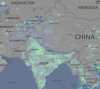
Below is light pollution map of Pakistan and Northern India. You can clearly see the largest and most intense LP in huge clump that sits over Pakistan and Northern India. Majority of Pakistan is lit up bright.

Below is annotated image map of the wider region. Again this clearly shows that all of the main population zone of Pakistan is lit bright. Only The Pak/Afghan border is marked red. Balochistan which has smaller population then most large cities is marked within white line.Even with this huge expanse with very low density the Quetta region is lit up. In comparison large swathes of India which have huge population display same DP as Balochistan. The Pak/India border is marked black. The region along the border is mostly Thar desert also has low DP but the population density there is approaching zero.
What is clear that all the regions with major populations in Pakistan, Punjab, Khyber Pakhtunkwa, Sindh are are giving off max DP suggesting heavy electrification.

I then took a look at the Kashmir region. Specifically Azad Kashmir and the LOC. Here things were real interesting. The white line is Pakistan Azad Kashmir border. The red line is the LOC. It is quite apparent that despite being hilly AK is very well it up as it has medium level LP despite having low population. Shockingly the LOC clearly demarcates the differance on Azad and Indian Occupied sides. It is low LP on the Indian side of LOC and medium on the Pak Azad. Again I suggest you go to the link provide above and zoom in to see how LOC marks the darkness versus light on the Pakistani side. This says lot about development on the Indian side and India generally. Despite having launched a intenational campaign of "Shining India" the real truth as shown by these LP maps is that is is indeed Pakistan that is "Shining". Facts and perception don't quite add up here.
Just a note I would like to add here. These LP Maps have not been produced by anybody linked to Pakistan. I have not doctored anything other than annotating some lines. The source of the date is US National Oceanic and Atmosphere Administration ( NOAA ) Satellite Information Service or US National Physical Data Centre. Furthermore they are not Pakistan specific but cover data for the world. This data is about as objective your going to get. Kashmir Region below.

The US NOAA Earth Data Centre has prepared Who’s in the Dark: Satellite Based Estimates of Electrification Rates which build up from the raw satellite imagery the agency collates. The result are surprising although frankly I half expected this based on my anecodotal evidence as having travelled to remote regions even in the mountains you can't escape power lines.Thus far most people use date prepare by IEA which itself relies on data supplied by countries concerned or estimates.
This is where things confirmed the LP data maps. Pakistan which according to IEA has 54% electrification actually according to the satellite imagery data cross referanced with population zones had over 91% electrification rate. Yes that is 91% which in one sense is great news as indeed it is Pakistan that is shining in particular when we look at Indian rates later. However it also shows mass electricity theft on industrial scale. That means 91 minus 54 equals massive 33% of Pakistan's population is involved mass theft. I think most of us probably already knew this but still when you see the facts it is shocking. are we surprised that electric supply companies are bankrupt and we have shortage of supply? The reason is simple. far more people are hooked up to a network that ostensibly is geared to supply 33% less. No wonder we have problems in Pakistan.
Also rather surprisingly India came out poor compared to Pakistan - It did rather well compared to China. Apparently China has similar electrification rates as India despite IEA figures showing higher. Apparently large areas of China hinterland are poorly served in particar Sichuan province. Any here are the figures for electrificatrion based on satellite data and as reported. Of courese there is 1-2% error factor.
Pak - 91% against 54% reported
Chin- 76% against 99% reported
India- 75% against 55% reported
It is obvious that reported figures tabulated by IEA that the world uses is grossly unfair and off mark as regards Pakistan. That also applies to India although the reported figure is closer to the real figure. In fact going by reported figure India has slightly better electrification then Pakistan. Now the real time images tell the truth that Pakistan is almost approaching full electrification. The sparse Balochistan and some desert regions or mountains on Afghan border are the 8% missing otherwise Pakistan would be 100%.
Click > http://ngdc.noaa.gov/eog/pubs/Elvidge_WINTD_20091022.pdf
There is another side to this. In the developing world various studies have shown that LP can help in showing the size of economic activity. There is some correlation.
Click > http://www.prophet.co.za/wp-content...r_measuring_the_true_size_of_the_economy1.pdf
Using various data sets US NOAA has prepared global poverty estimates. Here again Pakistan comes out shining. Only Balochistan underperforms but as we all know it has tiny population of less then 5% of Pakistan. All the large population zones where most of Pakistan lives come out looking great. Punjab, Khyber Pak and Sindh come out looking great.
On the contrary India has large parts in particular the east of Delhi to Kollkata zone proximating to the Ganga Basin which has plus 400 million people that are no better than Sub Saharan Africa. No surprises there.
I have coloured Pakistan in red line. Balochistan which has tiny population is colured in white. As can be seen Kyhber Pak, Punjab and Sindh come out great. Only the tiny Balochistan and evensmaller Gilgit Baltistan come out poor although the later has population less then 2.5 million. The result is vast 94% of Pakistan comes out with great figures.
Contrast this with India where huge swathes of population covering 100s of millions are in show extreme poverty figures similar to Africa. Below Global Poverty Estimates.

Click > NOAA/NGDC - Earth Observation Group - Defense Meteorological Satellite Program, Boulder
Below Map showing world electrification rates based on satellite data rather than as reported. Pakistan comes out as shining and is in the light yellow band similar to Iran or Turkey compared to darker India.

Click > http://ngdc.noaa.gov/eog/image/ElectrificationRates.pdf
I hope this helps in actually seeing what the reailty sourced from real imagery as opposed to subjective propaganda and biased reports that often Pakistan is subjected to. It appears this country that some love to call "failed" has been doing rather well.I will be looking into more real imagery derived from satellites to look at road networks and housing/urban environment of the cities in South Asia to see the reality versus perception.
Click - Sizing up economies by using satellite data > http://www.prophet.co.za/wp-content...r_measuring_the_true_size_of_the_economy1.pdf
Data source unless stated otherwise directly from NOAA.

@waz @Shamain @PAKISTANFOREVER @Providence @Nihonjin1051 @Serpentine @Daneshmand @Indus Falcon @AgNoStiC MuSliM @Jaanbaz @Aminroop @SarthakGanguly @Raja Pakistani @WAJsal @Irfan Baloch @Areesh
I came across this ( below ) which is Light Pollution Atlas 2006 which is based on Satellite imagery drawn from a composite date set. The results are remarkable. Pakistan appears to be lit like torch. All major population centres of Pakistan like Punjab, Khyber Pakhtunkwa and Sindh are lit bright. Only the sparse Balochistan which has huge surface area but population ( minus 13 million ) less than most South Asian cities or the border deserts of Sindh ( Thar or Cholistan ) have low light output. Having said this even in Balochistan the small capital Quetta is shining bright.
Click > Balochistan, Pakistan - Wikipedia, the free encyclopedia
Now this shows something we have known ( at least I have felt that for long time ) for some time. That Pakistan is far more developed then the skewed reports filed by Western agencies in Washington or New York. The reality is they ( researchers ) rarely go to Pakistan and rely on third hand information much of it infuenced by the negative publicity the country gets. Researchers are apt to accept extremely harsh claims against Pakistan without doing much cross referanceas they already hold a very low opinon of Pakistan.
The result is figures collated by organizations of world repute like UN etc tend to be pick up the less than accomodating to Pakistan with no benefit of doubt given. Also we cannot ignore increasing Indian's presence in USA who are as impartial to Pakistan despite being "American" like I am impartial to India despite being "British".
So let us look at what the real world Satellite imagery reveals about our world and in particular Pakistan in context of South Asia. Be prepared to be surprised. Below is Light Pollution Images. I suggest you click and then zoom and navigate to see the real situation on the ground. One thing is clear Pakistan is shining bright despite the load shedding. These images are composites so they rely on multiple images across a wide data set to produce the final product. In short they are average over time span. I strongly suggest you click on the links below and navigate or zoom to the regions your interested as it covers the earth.
Click > Light Pollution Atlas 2006
Click > Light Pollution Atlas 2006
What is shocking is even war torn FATA right on the Afghan border is doing reasonably well and no worse then say Uttar Pradesh in India. This is surprising considering FATA is low density, periphery, borderland and war torn. In comparison Utter Pradesh and other states in India east of it have 300 million plus yet most of them appear to be giving off as much or slightly more light pollution then FATA. Considering this part of Ganges basin is extremely dense and Indian heartland with plus 300 million people this is surprising.
Below is Light Pollution Map of Afghan border and FATA where presently Pak Army is fighting a war against terrorism. Miran Shah, Sadda etc can be seen. These have almost as much light pollution ( LP ) as vast areas of dense hearlands of India like Utter Pradesh or Orrisa. FATA has population of just over 3 million spread over and along the rugged mountains on the Afghan border yet it seems to have LP output equal to large parts of central India which is densely packed. If you want to zoom in please use the links provided above to zoom in and navigate.
Federally Administered Tribal Areas - Wikipedia, the free encyclopedia
Below is light pollution map of Pakistan and Northern India. You can clearly see the largest and most intense LP in huge clump that sits over Pakistan and Northern India. Majority of Pakistan is lit up bright.
Below is annotated image map of the wider region. Again this clearly shows that all of the main population zone of Pakistan is lit bright. Only The Pak/Afghan border is marked red. Balochistan which has smaller population then most large cities is marked within white line.Even with this huge expanse with very low density the Quetta region is lit up. In comparison large swathes of India which have huge population display same DP as Balochistan. The Pak/India border is marked black. The region along the border is mostly Thar desert also has low DP but the population density there is approaching zero.
What is clear that all the regions with major populations in Pakistan, Punjab, Khyber Pakhtunkwa, Sindh are are giving off max DP suggesting heavy electrification.
I then took a look at the Kashmir region. Specifically Azad Kashmir and the LOC. Here things were real interesting. The white line is Pakistan Azad Kashmir border. The red line is the LOC. It is quite apparent that despite being hilly AK is very well it up as it has medium level LP despite having low population. Shockingly the LOC clearly demarcates the differance on Azad and Indian Occupied sides. It is low LP on the Indian side of LOC and medium on the Pak Azad. Again I suggest you go to the link provide above and zoom in to see how LOC marks the darkness versus light on the Pakistani side. This says lot about development on the Indian side and India generally. Despite having launched a intenational campaign of "Shining India" the real truth as shown by these LP maps is that is is indeed Pakistan that is "Shining". Facts and perception don't quite add up here.
Just a note I would like to add here. These LP Maps have not been produced by anybody linked to Pakistan. I have not doctored anything other than annotating some lines. The source of the date is US National Oceanic and Atmosphere Administration ( NOAA ) Satellite Information Service or US National Physical Data Centre. Furthermore they are not Pakistan specific but cover data for the world. This data is about as objective your going to get. Kashmir Region below.
The US NOAA Earth Data Centre has prepared Who’s in the Dark: Satellite Based Estimates of Electrification Rates which build up from the raw satellite imagery the agency collates. The result are surprising although frankly I half expected this based on my anecodotal evidence as having travelled to remote regions even in the mountains you can't escape power lines.Thus far most people use date prepare by IEA which itself relies on data supplied by countries concerned or estimates.
This is where things confirmed the LP data maps. Pakistan which according to IEA has 54% electrification actually according to the satellite imagery data cross referanced with population zones had over 91% electrification rate. Yes that is 91% which in one sense is great news as indeed it is Pakistan that is shining in particular when we look at Indian rates later. However it also shows mass electricity theft on industrial scale. That means 91 minus 54 equals massive 33% of Pakistan's population is involved mass theft. I think most of us probably already knew this but still when you see the facts it is shocking. are we surprised that electric supply companies are bankrupt and we have shortage of supply? The reason is simple. far more people are hooked up to a network that ostensibly is geared to supply 33% less. No wonder we have problems in Pakistan.
Also rather surprisingly India came out poor compared to Pakistan - It did rather well compared to China. Apparently China has similar electrification rates as India despite IEA figures showing higher. Apparently large areas of China hinterland are poorly served in particar Sichuan province. Any here are the figures for electrificatrion based on satellite data and as reported. Of courese there is 1-2% error factor.
Pak - 91% against 54% reported
Chin- 76% against 99% reported
India- 75% against 55% reported
It is obvious that reported figures tabulated by IEA that the world uses is grossly unfair and off mark as regards Pakistan. That also applies to India although the reported figure is closer to the real figure. In fact going by reported figure India has slightly better electrification then Pakistan. Now the real time images tell the truth that Pakistan is almost approaching full electrification. The sparse Balochistan and some desert regions or mountains on Afghan border are the 8% missing otherwise Pakistan would be 100%.
Click > http://ngdc.noaa.gov/eog/pubs/Elvidge_WINTD_20091022.pdf
There is another side to this. In the developing world various studies have shown that LP can help in showing the size of economic activity. There is some correlation.
Click > http://www.prophet.co.za/wp-content...r_measuring_the_true_size_of_the_economy1.pdf
Using various data sets US NOAA has prepared global poverty estimates. Here again Pakistan comes out shining. Only Balochistan underperforms but as we all know it has tiny population of less then 5% of Pakistan. All the large population zones where most of Pakistan lives come out looking great. Punjab, Khyber Pak and Sindh come out looking great.
On the contrary India has large parts in particular the east of Delhi to Kollkata zone proximating to the Ganga Basin which has plus 400 million people that are no better than Sub Saharan Africa. No surprises there.
I have coloured Pakistan in red line. Balochistan which has tiny population is colured in white. As can be seen Kyhber Pak, Punjab and Sindh come out great. Only the tiny Balochistan and evensmaller Gilgit Baltistan come out poor although the later has population less then 2.5 million. The result is vast 94% of Pakistan comes out with great figures.
Contrast this with India where huge swathes of population covering 100s of millions are in show extreme poverty figures similar to Africa. Below Global Poverty Estimates.
Click > NOAA/NGDC - Earth Observation Group - Defense Meteorological Satellite Program, Boulder
Below Map showing world electrification rates based on satellite data rather than as reported. Pakistan comes out as shining and is in the light yellow band similar to Iran or Turkey compared to darker India.
Click > http://ngdc.noaa.gov/eog/image/ElectrificationRates.pdf
I hope this helps in actually seeing what the reailty sourced from real imagery as opposed to subjective propaganda and biased reports that often Pakistan is subjected to. It appears this country that some love to call "failed" has been doing rather well.I will be looking into more real imagery derived from satellites to look at road networks and housing/urban environment of the cities in South Asia to see the reality versus perception.
Click - Sizing up economies by using satellite data > http://www.prophet.co.za/wp-content...r_measuring_the_true_size_of_the_economy1.pdf
Data source unless stated otherwise directly from NOAA.
@waz @Shamain @PAKISTANFOREVER @Providence @Nihonjin1051 @Serpentine @Daneshmand @Indus Falcon @AgNoStiC MuSliM @Jaanbaz @Aminroop @SarthakGanguly @Raja Pakistani @WAJsal @Irfan Baloch @Areesh
Last edited: