Nanga Tarzan
FULL MEMBER

- Joined
- Oct 7, 2016
- Messages
- 157
- Reaction score
- -4
- Country
- Location
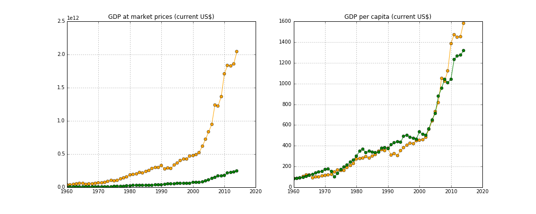
Being a Machine Learning enthusiast, I thought it would be fun to compare India and Pakistan based on factual data. These graphs are based on the data provided by World Bank. A couple of notes:
1. GDP
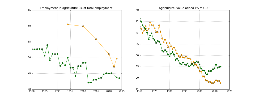
 2. Agriculture GDP: The biggest reason for India's per-capita GDP being so low is that 50% of Indian population is engaged in agriculture but this sector contributes only 17% to the GDP. This ratio is much better for Pakistan.
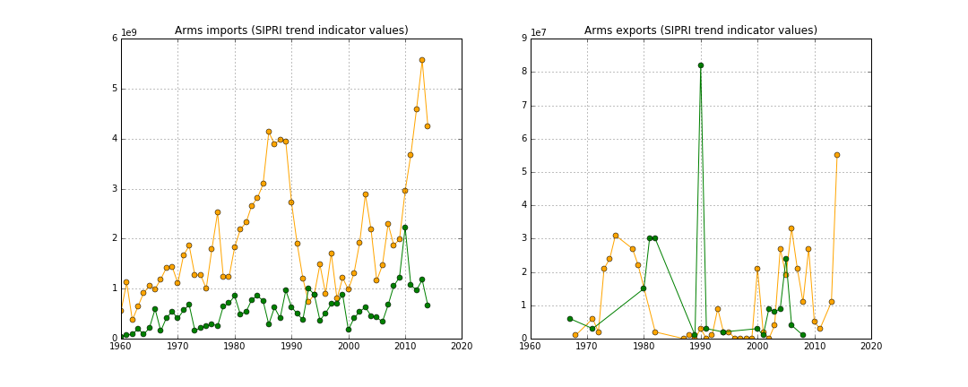
3. Arms import and export
4. Armed forces Strength

5. Birth/Death Rate

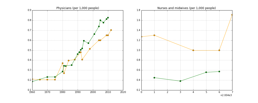
6. Doctors and nurses. Notice the lack of nurses and midwives in Pakistan which contributes to infant mortality (shown in a separate graph).
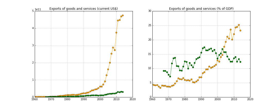
7. Exports
8. Health Expenditure

Due to the limitation of 8 images per thread, I'll post the remaining graphs in a separate thread
- Due to disparity between India and Pakistan in terms of geographical size and population, the absolute numbers do not matter; what matters is the trendline.
- I have tried to use 'per capita' or 'per unit' data wherever available.
- India is orange and Pakistan is green. The labels at the top of each graph denote what the data is about.
1. GDP
3. Arms import and export
4. Armed forces Strength
5. Birth/Death Rate
6. Doctors and nurses. Notice the lack of nurses and midwives in Pakistan which contributes to infant mortality (shown in a separate graph).
7. Exports
8. Health Expenditure
Due to the limitation of 8 images per thread, I'll post the remaining graphs in a separate thread


